Showing posts with label Tuesday's Tips. Show all posts

Tuesday, March 30, 2010

{Tuesday's Tip: MY Top 10 Cricut Cartridges}

Several times a month, I will get emails asking me what cartridges I use the most, if a certain cartridge is worth purchasing or simply which ones I would recommend to someone purchasing their first Cricut. I am all too happy to respond. The world of Cricut Cartridges is overwhelming these days! They are releasing new carts ALL the time. When I purchased my first Cricut, there were just 15-20 carts to choose from, so it has been nice to grow my library as Cricut has expanded their available images.

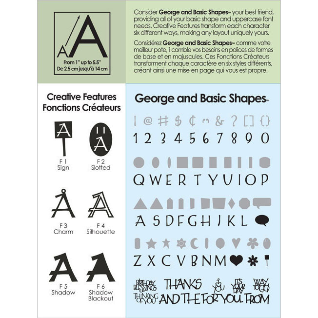
The cartridge I use the MOST and I mean it never leaves my Jukebox is George and Basic Shapes. This cart came with my first Cricut and it is an essential. It's the "basic shapes" that has me using it all the time. I especially use it for the tags, flowers and hearts. I also love that there is a "silhouette" cut so that I can cut any of the shapes into frames. It's a hard one to find if you don't have it, but worth hunting it down and purchasing.


There is another cart that never leaves my Jukebox and that is Storybook. I cannot tell you how happy I am that I bought this cartridge. I wasn't even sure about it when I sent for it... °Ü° It's a must, especially if you like the more modern images. I use it for frames, letters, flowers, just about everything! There are SO many cuts you get from this cart that I had to include photos of all the different modes for you to see. I am telling you, go get this one, you won't regret it.


The next one I use is Accent Essentials. This cart has some great images that you will use more than you think you will. I love the frames and the scrolls. I use the snowflake image A LOT! I also love the leaves and arrows.


The next is Home Accents. To this day, I mix it up with the Accent Essentials. To me, Home Accents is an extension of the Accent Essentials cart. I use the damask images, leaves, scrolls, frames and words a lot in my family albums. I love that it is a solutions cart and inexpensive. I got this one on sale for $21. Can't beat it. It has been in Jukebox since I got it!


I love Plantin Schoolbook. When I first bought I thought to myself, "Why did I get this one?" BUT, then I noticed I was using it and on a weekly basis! Like George, it's basic shapes are awesome and I do love the simple font. The flower, leaf and apple are the images I use the most. I do like the rick-rack, it's nice to create a long line of it on Designer Studio, though sometimes I find it easier just to use the real thing! °Ü°


I think you know that I this next one from my past couple of month's worth of posts. The Indie Art cart is a fun one. I bought it because of my daughters. I also bought it to help with creating my own high school pages. It's a great "boy" cartridge and a must if you have teens or young adults.


The next one is Fabulous Finds. I love this one because if you are running low on metal embellishments or just don't want the weight of bulk of metal embellishment, this cart offers you the perfect alternative. I use the bookplates all the time! I also love the the different tabs. You know how buying dividers for binders can be pretty pricey? I have used heavy patterned cardstock, cut it to 8.5x11 and added my own tabs. Not only do they look nicer, but I can get a exactly as many as I want and for much less $. I love this cart!


This next one is surprise for me. Stretch Your Imagination. I really didn't think I would use it very much, but I do. It has so many fun and unusual shapes on it and yet I find myself going to all the time to see if it has what I need and you know what... it usually does! Truthfully, I use it most for the flourishes, but I do cut more and more images from it every week.


This one is also one of my very first carts and I still use it all the time to this day. Doodlecharms. The cupcake, the sun, ladybug, popsicle, watermelon, bus... I could just keep going. It's a great cart for seasonal and kid pages. I don't know how any Cricut library can go without this cart. it!


Mickey and Friends is another always in the Jukebox. This cart has lots of fun everyday images that come with the bigger ones. Even if I am not working on a Disney page or card, I still find myself going to find what I need on this one. When they first announced they were releasing this one I could not wait! I paid full price for it and it has been worth every single penny. °Ü°


So, there you have it. The 10 carts I use the most.
Two of my other favorite font carts, and ones I do use regularly are:
  • Alphalicious
  • Tear Drop
Other fav character carts I use a lot:
  • Pooh and Friends
  • Hello Kitty
  • both Princess carts
  • Tinker Bell
In case you are wondering which carts I use the least, they are:
  • Paper Pups
  • Doodlefont
  • Zoobaloo.
Carts I just bought, haven't tried out yet, but are really excited about:
  • Sponge Bob Square Pants
  • Forever Young
  • Sweet Treats
  • Home Decor
  • Everyday Paper Dolls
  • Sentimentals

On my wish list:

  • Create a Critter
  • Robotz
  • Independence Day
  • Heritage
  • Just Because Cards
  • Give a Hoot
  • Preserves
  • Once Upon a Princess

Tuesday, March 16, 2010

{Tuesday's Tip}

Sorry, No Tuesday's Tips today. I've had some things come up this week and it's a little more busy than usual! Hoping to be back next week with more fun and informative tips!
THANKS FOR YOUR UNDERSTANDING! °Ü°

Tuesday, March 9, 2010

{Tuesday's Tips: "Rock Star" Matchbook Brag Book}

Today, for our "Tueday's Tips", I thought we would make something fun, quick and basically simple: a matchbook brag book! I love little projects like these because I can actually finish them in one setting. I also love them because they make great gifts for moms, dads, friends cousins, uncles... who ever! °Ü°

You are going to need the FABULOUS FINDS Cricut Cartridge. {These can be cut by hand, but the Cricut makes it easy and calculates all the dimensions for you.} In the booklet, turn to page 127. I cut the lower one, the one that is more square and true the matchbook shape. Set the dial size to 4". I know they usually are smaller than this, but I am going to be putting wallet sized photos of my daughter in this and I didn't want to have to cut any of them down, PLUS 4" leaves room for journaling and embellishments.


For the cover, I cut it on BLACK OUT because I wanted to create my own cover. If you do not cut it this way, it will cut a window in the cover for you, which is nice, but not what I wanted. This is your choice, though. I used Bazzill Raven colored textured card stock for the cover, then I used paper from Rusty Pickle: Pirate Princess paper collection for the inner pages of the book. I am in ♥ with this paper! Since I wanted the book to fun and all with pictures of my daughter, I knew this was the paper for the project! {You can cut as many pages for the inside that you would like. I cut 5 inserts, this will give me a total of 20 pages}


Now, take your scoring tool {Be sure it is NOT the cutting blade...trust me, I've done it :( } Score along the small cuts the Cricut created for you. There are 4 total on the cover and 1 each on the pages. Don't push too hard, even the scoring tool can rip your papers. Just use enough pressure to put a small indented line where you want it.


If you are going to ink the edges, now is the time. It is going to be too difficult once the book is put together. I used Color Box's Black Bird ink.


Once you have inked, fold the cover and pages on the lines you have scored.


Now, take all the pages and put them in the order you would like. Mine are all double sided, so I took a few minutes to coordinate them all together in the order I wanted them. Once you have them folded together, you are going to want to line them up between the thinner, smaller scored lines in the book. Be sure that if you are going to have the traditional book-look, that your papers are right side up. See what I mean?


Now we are going to staple the book together. Here is a little trick a Junior High School teacher taught me. If your stapler is not long enough to reach where you need it staple (and mine wasn't), line you papers up the way you want them, paper clip them in place if they are slipping and won't stay put. Now, find a table or space where there is a small, straight crack. I use my dining room table where the leaf is in it. Make sure the crack is only about 1/4 of an inch wide. Place your booklet, where you are going to staple, right over the crack, then take your stapler, open it up straight and push the staples straight down through your papers. Be sure to center them so you don't get your table or counter or whatever you are using. Once the staples are in, turn the booklet over and your staples will be sticking straight up. BE CAREFUL! Take a Popsicle stick and gently push the staples down. There you have it! Staples are in place and your book is now tightly put together.


Now, you can fold your matchbook up and make sure everything fits nicely together.


When you open the book, this is what you will see, your first page. {You do not have to have your book open this way, it can stand straight up just like a real matchbook, I wanted my to flip right to left like a real book though. Play with it and see what works for you}


Now, time to decorate! The fun part! °Ü° Measure your papers out and cut them to size. Adhere down the front cover, back cover and spines.


To cover the ugly staples, I took 20" of ribbon and tied it around the center of the book and tied a bow on the outer spine, covering them up. Adds a little something fun, too. Yes?


To the ribbon, I added two silver toned stars and pinned them with a baby safety pin. More fun...


The "Rock Star" is a stamp that I stamped on pink textured card stock and cut out. Using 3D pop dots, I adhered it to the front. 3 pink star shaped brads were also added.


Here's the spine.


The back is just decorative paper. I thought about adding more, but really liked just this.


When you open it, this is what you see. I added the skull and cross bones with a fame to the inside. I thought it pulled all those cute Pirate Princess papers together.


As you can see, I haven't add photos yet. I am going to have my daughter help me choose the photos she wants in here and then we will embellish all the pages. Because each and every page is decorative, it will be quick to get the photos in, add some brads, ribbon, and die cuts from the Indie Art Cartridge.

So, there you have it! If you've got a couple of hours and want to make a cute project for yourself or someone you know and love, this is a fun one! Let me know how you do... °Ü° I would love to hear about themes, papers and the different ways you come up with making your very own matchbook brag book!


HAPPY SCRAPPIN' °Ü°

Tuesday, March 2, 2010

{Tuesday's Tips: Chalks & Inks}

After my last Tuesday's Tips posts, I got several emails from ladies wondering about the different chalks and inks and wanting to know which kinds to purchase. I thought it would make a perfect post for this week.

It can be a little tough choosing with so many choices out there. I first started with chalks, about 8 years ago. This is the set I found at my local scrapbook store:


I instantly loved them! They came with a few "make-up" applicators (you can see them on the right side of the picture) and so I went and purchased a pack of 24 applicators at my local store so that I would have one for each color. Working with the applicators is easy and they are small enough to get just the right amount of color in tight spaces. I STILL have this same set today! Really, I do. They seem to last forever and even though some of the pieces are withered down with holes in them, this set is my old stand by. The average cost is about $14 for the set.

FYI, if you run out of applicators, Q-Tips work pretty good. They don't last as long, but they get the job done beautifully!

About 2 years ago, I was looking for some new chalks and found these at the same store I had purchased my first set from.

I bought three sets of them: Primary colors (seen in the photos), Pastels and Earth tones. These I didn't like so much. Some of the colors were so hard, you could hardly get any chalk to rub off onto the applicator and because of this, it tore my applicators up pretty good. Other colors were so soft that they crumbles to powder! For the most part, they worked like my first set, but it was frustrating to have to work with those colors that didn't quite cooperate. The average cost is about $9 each, I bought them because they were on sale for half off, so that wasn't so bad. Still, that put me on the hunt for newer chalks...
That hunt led me to these:


This is my most recently purchased set and I am in LOVE! °Ü° Each color has a matte and shimmer, which is why you see two halves of a whole circle. The ones on the top are shimmery and the bottoms flat matte. You can see that each color has 3 little white round puffy balls, called "pom-poms". They range in size from small, medium and large. These are your applicators! The tool to the far right, is what you use to grab the pom-pom of your choice, rub the color you need and apply it to your project! It also comes with a chalk eraser for mistakes (upper left tool), a burnishing spoon (which I have never used), a brush (equivalent to a "blush" brush) and stencils.


Pebbles Inc. is the manufacturer and sells refills for the pom-poms and eraser. A great set if you are looking. Lots of great colors and tons of versatility! The cost is about $28, I got my half off at JoAnns.com for $14. An EXCELLENT deal!

Ok, let's move onto inks. Like I told you last week, I prefer the Color Box Cat Eye Fluid Chalk ink pads. They come in over 45 colors, fit perfectly in your hand and are easy to work with. They go on like an ink and dry looking like you chalked the edges. For small spaces, I use a tiny paint brush and it works great! I have also used Q-Tips and daubers (will get to these soon) when working with crazy cuts and hard to reach edges. It requires a little more patience when using the brush and Q-Tips, but well worth the effect. The average cost for each is about $2. I usually find mine for about $1.19 on JoAnns.com.
Color Box also sells this set:


They are called Petal Point Ink Pads. There are 7 different sets, all sold in coordinating colors: pastels, earth tones and so on. The average cost in about $16 per set. These don't have the versatility of the Cat Eye pads, but you can use these with them:


Daubers. These ones in the picture, fit right on the end of your finger and allow you to work the ink. These are great for using with ANY ink pads you have. I do love them because they allow you the luxury of purchasing large ink pads and still having the ability to ink edges using all the fantastic colors that are offered in the larger pads. These are also sold in a smaller size, for smaller projects.

I really wanted to get some photos taken of how exactly to chalk and ink edges, but did not have time this week. It has been a little crazy around here and my daughter, who would have taken the photos for me, has been busy working. I still would like to them and hopefully will in the near future.

So, there you have a teeny-tiny idea of what is out there. The trick, again, is finding what works for you and then stick with it! Use scrap pieces of papers to practice your technique. Remember to start softly and then go on heavier with the color and lastly, just have fun with it! Like with any hobby or craft, there are endless possibilities to where you can take your shading! °Ü°

Saturday, February 27, 2010

{Tuesday's Tips: CRICUT~ Shading & Dimension}

Okay, so we know how to pick out papers, right? Now what do ya do with them? °Ü° Shading and dimension will bring your piecings to life! I guess it is the old painter in me, but I try not to look at any of my dies as a 2-dimensional object. I am always looking to give them a little more.

Let's take this cute little chick, for instance.
{Image can be found on the new Spring Seasonal Easter cartridge}


Here is the image freshly cut.

Here is the bow. You can cut 2 layers for it, which I love.

Put the cuts together and this is what you have.
A very cute little Spring Chick-A-Dee
hmmm...I think we can do better! °Ü°

Get out your inks, (or chalks, your choice)
I use Color Box's (Cat Eye) Fluid Chalk Ink pads.
They are small, inexpensive, and really easy to work with.


Here is what I cut: 1 yellow chick, 1 orange & white polka dot chick, 1 pink patterned bow and 1 solid darker pink cardstock bow.


So let's start with our chicks.


I know this sounds a little mean, but cut the legs off your yellow chick. Be sure to follow the natural line of the body, so you can't tell this is what you did. You want it to look like it was cut naturally, with the Cricut, when you are done.


Now, take your yellow inks, or chalks, and go around the edges. Don't worry about the eye. We have something else in store for that.


So now, your chick has gone from looking like the first image to the second. And we are lookin' good... movin' on...


Take your orange chick.
Again, I know it sounds mean, but cut off the beak.
Be sure to cut it at a curve. You want it to look like a real beak when you are done.
Ink or chalk around the beak and the legs. (You don't need to waste on the body, that part won't even show!)


Now, take your little yellow chick and adhere the beak over the yellow beak.
Adhere the yellow chick to the orange one.
This is what you get!
Notice, I have a little baby blue brad ready for the eye.


Now for the bow.
The chick I cut is 4" tall, so when I go to cut the bow, it automatically cuts it to the proportionate size.
I cut the first bow, the one with the ribbon holes cut out, with patterned paper at the same size as the chick.
BUT, for the darker cardstock bow, I upped the size to 4 1/4" so that it would be just a tad larger and give me a shadow effect.


Here's what it looks like layered and glued down. See how nice the darker edges look? Much nicer than if they were the same size.


For me, the bow is still missing something. We need some BLING!
By adding a simple gemstone to the center of the bow, you get a whole new look! One that has a bit of a richer feel. Love it!

But, we're still not done.
Take the bow and GENTLY, with your thumbs, bend and roll the edges up just a little bit. This is going to add a little more dimension, just a like a real ribbon bow has.

Adhere the bow to your chick and you are done!
How stinkin' cute is she? The original was cute... but this one STINKIN' CUTE! °Ü°
She has some life to her and is adorable.


If you want a more realistic look, skip the paper bow and tie a ribbon around her neck. Add a little flower for a festive look.


To add more dimension, I would use pop dots to adhere her to my card or scrapbook page. It's that easy! When you look at an image, allow your mind to see past what is there and create what you REALLY see! The possibilities are endless!
Here are a few more examples of what inking and chalking will do:


A little ink around the edges of the paper, ice cream and cone will add some life.


Okay, backing up... I love make-up! I always have! I remember being a little girl and sitting and watching my mom and my older sister do their make-up and loving every second of it. I was so excited when I got to wear it. So, what does that have to do with anything? Well...


When I create babies, kids, girls and the Princesses of Disney, I always put a little color on their faces. Blush will do a lot for an image. Eye shadow will make them striking! °Ü°


Here Snow White is with no make-up. How embarrassing. Ü


Here she is with a little blue eye shadow and some blush! Really makes those red lips of hers pop, wouldn't you say?
A little chalking to the faces will warm them right up and make them more realistic that you will ever believe!


I did the same with Ariel


For her tail, I took some white chalk and chalked where highlights would naturally be.


For Minnie, I inked the edges of her bow and dress with red ink. For her shoes, a yellow ink.


Using 3D pop dots, I popped up her bow, dress and nose. Shoes, face and eyes lay flat. The difference to using no 3D effect is huge!


Here's Goofy, you can't tell from this angle, but he has 3d effects, too.
First, note the inking around his shirt.
and shoes
I popped up his hat, shirt and pants.


So, there you have it. Play with chalking and inking. Use 3d pop dots. You will be amazed at the results you get and your images will WOW everyone who sees them. I always get asked, "How did you do that?" Well... now you know! °Ü°

LinkWithin

Related Posts Plugin for WordPress, Blogger...